The kitchen is one of the most important rooms in your home, and the color palette you choose for it can greatly impact its overall look and feel. Many homeowners opt for a traditional all-white palette, but that can feel boring and overdone after a while. You can infuse more character and personality into your space with bolder color choices. We’ll inspire you with these unique color palettes to make your kitchen pop.
Sage Green and Gold
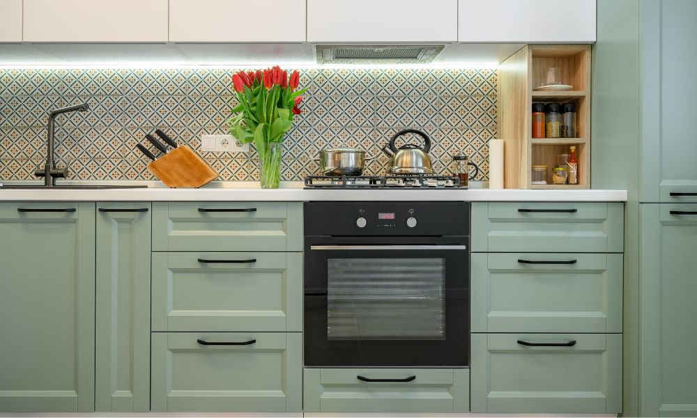
If you’re as tired of the all-white kitchens as we are, you can opt for a sage green and gold color palette. These colors work wonderfully together and add interest to the space without overwhelming it. Plus, using these colors is one of the perfect ways to give your kitchen a contemporary design. Sage green grounds the room with its earthy tone, while gold brightens and provides a sense of luxury. A light shade of sage green will create a warm and inviting atmosphere, while a darker shade will balance brighter accent colors.
When adding gold accents to your design, consider how they will bring out the space’s best features. Gold fixtures, such as cabinet handles and drawer pulls, are perfect for highlighting any furniture pieces in your kitchen. You could also use gold-toned wallpaper or an area rug with subtle metallic elements to add sparkle and shine to your space.
Terracotta and Charcoal
You’ll love a terracotta and charcoal-colored kitchen if you’re a free spirit who enjoys earth tones. The subtle burnt-orange hue of terracotta is perfect for adding warmth and energy to any space, while the deep shade of charcoal creates an elegant contrast that will draw attention to your design. Imagine your kitchen with charcoal cabinetry, a herringbone backsplash, and Rojo Alicante countertops. Rojo Alicante is a stunning marble with an earthy red-orange hue and white veining that perfectly suits your terracotta palette.
You could also add metal fixtures in lighter shades of gray to bring some lightness into the space. Finally, don’t be afraid to experiment with texture. Pairing matte finishes with glossy surfaces is a great way to create visual interest and depth within your kitchen design.
Slate Blue and Taupe
If you’re a little more traditional but still want a modern pop of color, consider a slate blue and taupe color palette. These are classic colors with a contemporary twist that are ideal for a transitional kitchen design. Slate blue is a cool hue that will create a soothing ambience in your space, while taupe adds warmth and lightness. The great thing about taupe is that you can lean into different shades. For example, you can use a taupe with rose undertones for a softer, more feminine look. Or you can opt for a sandy taupe with yellow undertones for a warmer, more energetic vibe.
Consider taupe wall paint and slate blue cabinetry to make the most of this color palette. Then, play with countertop and backsplash materials that complement the design. For example, Azurite granite and D’Azur quartzite are countertop materials that would work well with this palette. You could also use accessories such as patterned rugs featuring both colors to unify their presence throughout the entire space.
Now that you know some interesting color palettes for your kitchen, you can implement these ideas into your space. Play around with different designs until you find the perfect fit, and don’t be afraid to get adventurous with your choices.